8223 Charlie Hayford G321 FP
Monday, 23 April 2012
7. Looking back at your preliminary task, what do you feel you have learnt in the progression from it to the full product?
I feel that I have greatly improved my skills within Adobe products such as Indesign, Photoshop and Illustrator by looking back at my preliminary task where the components are less professional. By completing the preliminary task however, I developed skills in prepartation for the main task, as can be seen in the final product, the text stands out more and the effects are more professional, aswell as the layout which is more concise.
My photography skills have definitely improved, the images in the final product are much clearer, high quality and the lighting and angles make the pages on the final product stand out. In the pre-lim the images do not fit the pages and aren’t exactly clear. Therefore, my photography skills have developed to a great extent.
My editing skills in photoshop improved, as i did not use them in the pre-lim task, however in the final product i have adjusted the colour effects which makes the picture stand out more.
Overall, i have learnt many valuable skills during the production process, as can be seen in the comparison of the pre-lim and final product.
6. What have you learnt about technologies from the process of constructing this product?
Here is my Prezi that demonstrates what i have learnt:
http://prezi.com/ezo2ucjrlzp7/6-what-have-you-learnt-about-technologies-from-the-process-of-constructing-this-product/
http://prezi.com/ezo2ucjrlzp7/6-what-have-you-learnt-about-technologies-from-the-process-of-constructing-this-product/
4. Who would be the audience for your media product?
Before creating the product, I had a general idea who the audience of my magazine would be. The research I conducted before creating my magazine was beneficial as it gave me an indication as to how to create my magazine, what the house style would be and the sorts of things I would need in my magazine.
The typical audience for my magazine would be someone interested in the rock genre of music instead of mainstream chart music; they would also be interested in attending rock festivals and therefore would want to know about certain gigs that appeal to them.
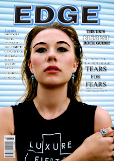
When producing my magazine I aimed my product at both male and females, who would aspire or be attracted to my model, therefore I used what I knew about reception theory so that my taget audience would receive the product how I wanted. Specifically the age range of my product is around ages 16-25. Therefore, I made the colour scheme of black, blue and white which can be well received by this maturing age group.
The use of imagery also represents the target audiences fashion style in both clothing and makeup, the dark clothing, black nail polish, rings, dark eye make-up & eyebrows all can be related to by the audience who may wear similar clothing, therefore when looking at the magazine they will be attracted to it.
Saturday, 21 April 2012
2. How does your media product represent particular social groups?
The social groups represented in my magazine are explored in my
research, which highlights the social groups such as the “mods and rockers” in
the past. The development of the punk genre in the 1970’s created a rebellious
social culture for rockers, which still continues today. However, the magazine
does not limit itself to a niche group, as rock music is becoming ever
increasingly popular and therefore I have concluded the my magazine aims at
16-25 years old, such as high school education and college students, young
workers & university students. I feel that the magazine is not childish as
some rock magazines and the colour scheme used makes it seem a professional
standard, along with the images used which appear to make the magazine less
childish, and the audience may appeal to the model used who is around the same
age of the target audience and therefore the audience can relate to the
imagery, making it more appealing to them. The editing used, such as the dark
eyebrows along with the dark makeup worn by the model applies to the rock genre
social groups as well as the use of guitar on the imagery of the contents page,
making the magazine more interesting to instrument fans, especially the
traditional rock instruments, the drums & guitar. However, some magazines
such as “Kerrang!” is more extreme with its colours whereas my magazine can be
more appealing to people interested in different genres of music due to its
more passive colour scheme of blue, black and white and the less aggressive use
of imagery which is quite subtle in expressing that the magazine belongs in the
rock genre.
I have also interviewed my brother, asking him what he thinks about the social groups that my magazine represents. My brother is studying a degree in media and therefore his views are helpful.
I have also interviewed my brother, asking him what he thinks about the social groups that my magazine represents. My brother is studying a degree in media and therefore his views are helpful.
Subscribe to:
Comments (Atom)


